Digital Project Critique- Streetscape Palimpsest: A History of Georgia Avenue
- Mar 20, 2025
- 4 min read
Updated: May 22, 2025
Growing up in an economically disadvantaged neighborhood to a low-income immigrant family, made me well aware of class struggles long before many of my grade-school peers. When I was finishing high school, a plaza near my neighborhood, made up of a deli markets a hairdresser that specializes in ethnic hair, and family-owned restaurants that provided affordable services to the community, was bought out and set for demolition. Years later, a sign appeared in front of the construction site announcing plans for brand-new luxury condominiums. This experience showed me how class shapes people's identities, influencing the opportunities they have, the spaces they occupy, and how they are perceived by society.
While searching for a digital project to focus on for this assignment, I came across Streetscape Palimpsest: A History of Georgia Avenue. This map-based storytelling project was created by Marni Davis, an associate professor of history at Georgia State University. Her work, which explores ethnicity and immigration, aims to highlight the gradual gentrification of Summerhill, one of Atlanta's oldest African American neighborhoods over the past century.
I recognize that this project goes beyond class identity and highlights the importance of critical race theory, particularly in showing how racial bias has shaped urban development. However, through my own lived experience, I connected strongly with the critical frameworks of post-capitalism and platform economies, especially in how they expose the concentration of wealth in the hands of powerful elites. I was drawn to this project because of how it uses data to tell a deeply human story. Rather than simply presenting numbers and facts, Streetscape Palimpsest mobilizes data to reveal the lives, memories, and communities that were uprooted, something that resonated with me personally, having witnessed similar changes in my own neighborhood.

A collection of historical images and video clips is thoughtfully compiled to present side-by-side comparisons with modern visualizations of the same region. The project also includes city planning and development records, effectively utilizing data to showcase the loss of cultural landmarks and the economic marginalization of low-income residents. These powerful contrasts often remind us that many small businesses and community hubs are no longer present. For instance, along Georgia Avenue’s commercial blocks, the number of businesses dropped between 1960 and 1970 from 58 to 25. In their place, new developments have emerged, designed to modernize the area and attract different demographics. However, this transformation has gradually contributed to the displacement of African American residents and various immigrant communities.
Streetscape Palimpsest offers a powerful critique of economic hegemony, revealing how urban renewal often consolidates wealth and power in the hands of the corporate elite. The first way of doing so is by informing us how racial bias played a role influencing Atlanta’s urban environment. Atlanta's white city leaders and entrepreneurs believed that racially mixed neighborhoods posed a threat to property values and public safety. As a result, they pursued policies aimed at creating racially and ethnically uniform residential areas, largely to protect property values in predominantly white neighborhoods. By challenging economic hegemony, Marni Davis encourages dialogue about alternative economic models that prioritize social equity over profit.
Another way the project critiques data hegemony is through direct testimonies from former and current residents from the Georgia Avenue area. She conducted several interviews and uploaded them along with the maps and photographs. By including these voices, the project highlights the lived experiences of individuals who have witnessed and shaped the area's evolution over time. This approach disrupts the narrative of economic progress as inherently beneficial, encouraging viewers to critically examine the broader impacts of gentrification.
Returning to the personal anecdote I shared earlier, I believe it emphasizes the ways in which these biases and power dynamics continue to shape urban spaces. Many of the businesses I once frequented have since been displaced, replaced by luxury condominiums that far exceed the market value of the surrounding homes that remain in the area. On the main floor of these new developments are upscale retail stores and non-essential services that cater to upper-class residents, making the spaces feel neither welcoming nor accessible to the area's original, predominantly low-income residents.
I want to briefly touch on the design of the project. I have hands-on experience working in user experience design, so I believe some of my insights could be valuable. I want to preface this by noting that my critique does not pertain to the information and story being shared, but rather its presentation.
Right away, I experienced a degree of information overload. While it’s understandable that capturing the nuance of gentrification in this historically and culturally rich region of Atlanta cannot be achieved through just a few images and video clips, cluttering the interface with excessive information made it difficult and extremely time-consuming to navigate. This may discourage readers from taking the time to absorb the main ideas and reflect.
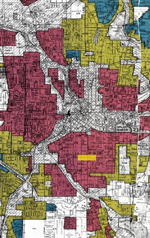

Also, while mapping is an effective way to explore the geographical context of this issue, it may not resonate with everyone. I felt that the interviews and photographs were the most powerful aspects of the project. They offered a deeper, more personal connection to Summerhill, allowing me to immerse myself in the neighborhood’s history and reflect on its transformation in a meaningful way. From my experience using mapping technologies in previous CTS courses, I’ve found that the message can sometimes lose impact when navigating through multiple maps. The way data is visualized on maps can unintentionally emphasize certain narratives while downplaying others, potentially reinforcing biases. Personally, I would have appreciated seeing more representation of the Black community's resistance and their rich contributions in shaping the region, rather than solely portraying them as victims of systemic injustices.
Overall, despite the information overload, I found the interface analysis engaging and believe it offers valuable insights into class dynamics and cultural erasure!

Comments